Riddle: Where is the only place catastrophic mad-made global warming exists?
Answer: In a computer.
Example #1
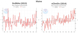
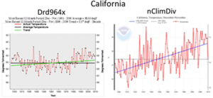
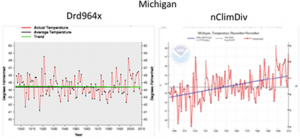
Following are some recent “adjustments” made to the software used by NOAA to create the US portion of their global temperature tracking. The transition to the new computer programming began in February of last year. Old and new graphs for Maine, California, and Michigan are below. Old graph on the left, new graph on the right. Remember, this is the same data. Forty of the forty eight mainland states experienced similar “changes.”
Notice any difference? With the same data, NOAA is now claiming a warming rate of 0.135F/decade, nearly double of what they were reporting for the same time period as recently as 2012.
If technical stuff makes your eyes glaze over you may want to move on to example #2 but the changes come from some basic differences in the new “software” which includes “revised station selection, homogenization, and gridding.” The change in “station selection” means ignoring the buoy readings (cooler) and choosing the intake readings on ships (warmer). The homogenization is a manual adjustment (faster warming of course) of temperature readings of the past to adjust for the urban heat island effect.
Example #2
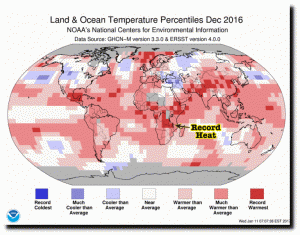
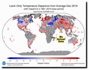
In February, NOAA published the graph below showing “record heat” in the dark red areas, a large swath of it across Africa. While not record heat, South America shows temperatures as “much warmer than average.” Wow, pretty bad. The world is burning up!
Now check out this graph showing the gray areas labeled as “missing data.” Almost all of Africa which they claimed had “record heat” had no actual data. South America also listed as mainly “much warmer than average” also had no data. They just guessed or made it up.
Yes, global warming is man-made. Just not the way they would like you to believe.


